Submitted 12 months agoA solution to the Four card feature section challenge
Four Card Page

@demon2316slayer
Solution retrospective
What are you most proud of, and what would you do differently next time?
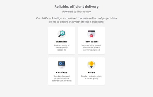
Well this was an interesting challenge but i decided to add my own style to it. The reason being i wanted to design it close but still wanted to experiment and add some originality.
What challenges did you encounter, and how did you overcome them?How can i position the elements which exactly as the image provided. This problem i encountered but i also did not want to waste more than a day so i made the design with some changes .
What specific areas of your project would you like help with?Maybe postioning of bottom elements exactly the same as the material provided.
Code
Loading...
Please log in to post a comment
Log in with GitHubCommunity feedback
No feedback yet. Be the first to give feedback on demon2316slayer's solution.
Join our Discord community
Join thousands of Frontend Mentor community members taking the challenges, sharing resources, helping each other, and chatting about all things front-end!
Join our Discord