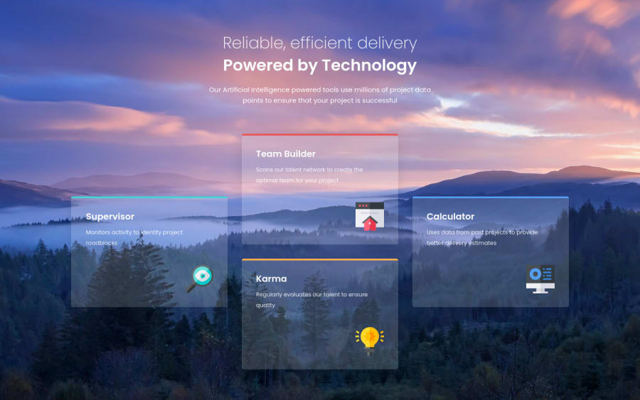
Design comparison
SolutionDesign
Solution retrospective
Challenge #13 Completed
Features:
- Fully Responsive
- Animations
- Glassmorphism Cards
- Hover Effects
- Additional Layouts
- Background Image
Built with:
- Mobile First Approach
- Semantic HTML (Structure)
- CSS Grid (Layout)
- CSS Flexbox (Alignments)
- Javascript (Hover)
Inspired by @vcarames
I saw his solution and since I love anything glassmorphism I decided to try it myself.
Any feedback is greatly appreciated ;)
Community feedback
- @0xabdulkhaliqPosted over 1 year ago
Hello there 👋. Congratulations on successfully completing the challenge! 🎉
- I have other recommendations regarding your code that I believe will be of great interest to you.
HTML 🏷️:
- Always avoid skipping heading levels; Starting with
<h1>and working your way down the heading levels (<h2>,<h3>, etc.) helps ensure that your document has a clear and consistent hierarchy. Source 📘
I hope you find it useful! 😄 Above all, the solution you submitted is great!
Happy coding!
Marked as helpful0@i7ectorPosted over 1 year ago@0xAbdulKhalid Hello 👋 thanks for the feedback!
I realised I forgot to change the heading levels back from h2 > h1 in the html as I was messing around with some stuff in css 😄
0
Please log in to post a comment
Log in with GitHubJoin our Discord community
Join thousands of Frontend Mentor community members taking the challenges, sharing resources, helping each other, and chatting about all things front-end!
Join our Discord
