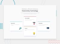
Design comparison
Solution retrospective
Had a little trouble positioning the two outer cards, tried using flex-box but it wouldn't change the position so ended up using margin-top. any idea on how I could have gotten it to work with flex-box?
Community feedback
- @pikapikamartPosted almost 3 years ago
Hey, awesome work on this one. Desktop layout looks fine but when resizing, the site's content are being hidden, take a look at points 990px and some issues arises. Mobile state is fine but the breakpoint is too early, right now mobile view occupies 0-985px which is too big don't you think? You could make use of something like 2x2 layout before transition to a single layout so that the layout will be seamless.
I agree with Abdul to use
gridon this one since it will be much easier. For some other suggestions, here are couple ones:- The texts
Reliable, efficient delivery Powered by Technologyis just a single phrase so it will be great to only useh1to wrap the text and just usemax-widthto make the text wrap on another row. Adjust themax-widthvalue until you got the desired result. - On the
.container, instead of usingwidth: 1110px, usemax-width: 1110pxso that the layout won't have an explicit size and will let the layout resize if it needs. - Lastly, just the mobile breakpoint and the idea of adding a 2x2.
Aside from those, great job again on this one.
Marked as helpful1 - The texts
- @abdulrahman-rwimPosted almost 3 years ago
Hey @jones9411, you can solve this problem using
gridI'm not sure how to solve it withflex-box,- this will solve the problem without using margin
.column.c { display: grid; align-content: center; }I hope this was helpful for you 😄
Marked as helpful1 - this will solve the problem without using margin
Please log in to post a comment
Log in with GitHubJoin our Discord community
Join thousands of Frontend Mentor community members taking the challenges, sharing resources, helping each other, and chatting about all things front-end!
Join our Discord

