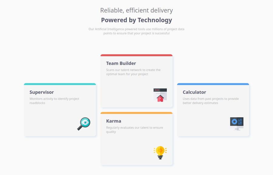
Design comparison
SolutionDesign
Community feedback
- @tailor-made-godPosted 6 months ago
Your website almost matching the design but few mistakes here and there. And your code is very clean and readable.
To fix the issues
- change the color of the card to white
- resize the header text in mobile to lower
- change the h1 tag font weight to 200 and wrap the second half in <strong > tag
- change the card size and icon size to lower to match the mobile design
- add margin on top of the header in any way you like.
Other than these few things your project is almost matching the design and your code is super readable.
0
Please log in to post a comment
Log in with GitHubJoin our Discord community
Join thousands of Frontend Mentor community members taking the challenges, sharing resources, helping each other, and chatting about all things front-end!
Join our Discord
