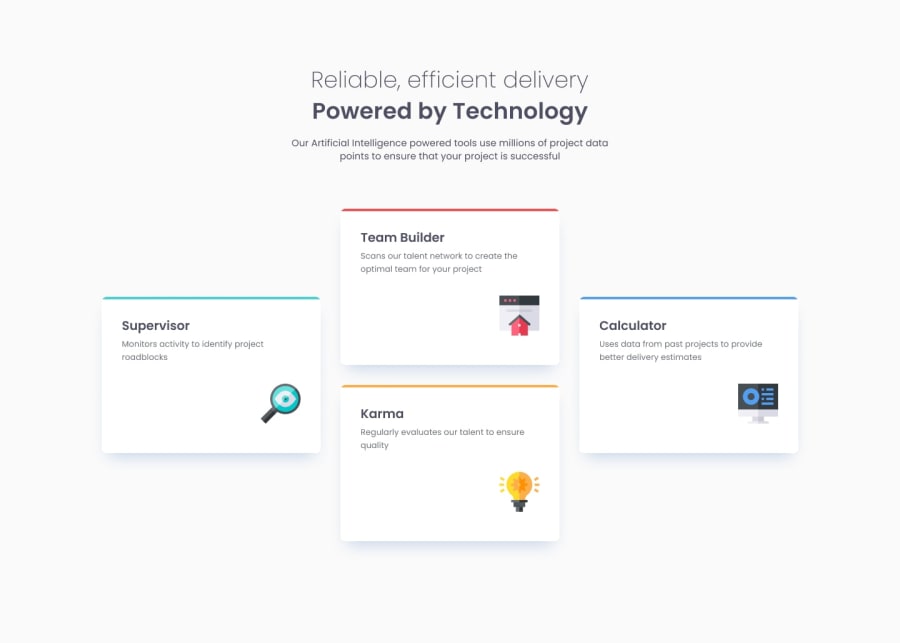
Design comparison
Community feedback
- @Saoud2021Posted 9 months ago
Your solution to the web design challenge is impressive and demonstrates a strong understanding of HTML and CSS. The use of semantic HTML tags enhances the document's structure and accessibility, which is commendable. However, there are a few areas for improvement. For better accessibility, consider using section tags for the feature cards and ensuring that all images have descriptive alt attributes. The layout looks good across different screen sizes, maintaining a clean and responsive design. The code is well-structured and readable, but it could be made more reusable by using classes more consistently and avoiding inline styles. Additionally, while the overall design aligns well with the original challenge, there are slight differences, such as the styling and positioning of elements, which could be fine-tuned to match the design more closely. Overall, you've done a fantastic job, and with a few tweaks, it can be even better!
Marked as helpful1
Please log in to post a comment
Log in with GitHubJoin our Discord community
Join thousands of Frontend Mentor community members taking the challenges, sharing resources, helping each other, and chatting about all things front-end!
Join our Discord
