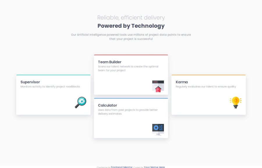
Design comparison
Solution retrospective
Not really proud, i have a lot of difficulties working with the desktop style.
What challenges did you encounter, and how did you overcome them?Yeah, i'll like to have a feedback on how i could develop the desktop design without affecting the mobile design.
What specific areas of your project would you like help with?I am looking forward to your feedback.
Please log in to post a comment
Log in with GitHubCommunity feedback
- @chenmeister
Overall the solution looks fine. However, I did notice the box components are wider than the design. What I would suggest is to add a max-width to the box components ex.
max-width: 375px. Also, I highly recommend using CSS grid for the box components as they will make the flow more organized.Marked as helpful
Join our Discord community
Join thousands of Frontend Mentor community members taking the challenges, sharing resources, helping each other, and chatting about all things front-end!
Join our Discord
