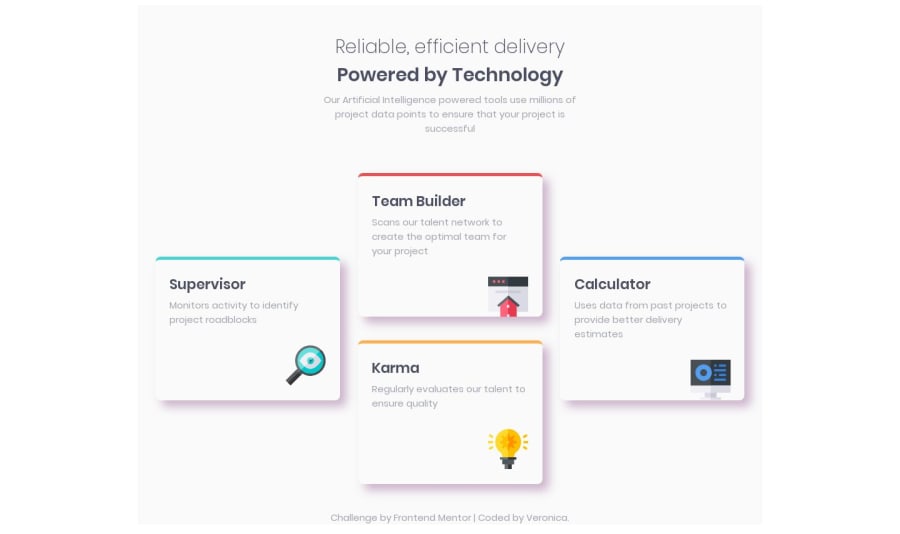
Design comparison
Solution retrospective
When the style guide gives widths ('the designs were created to the following widths: mobile: 375px desktop:1440px'), do you take that to mean max-width? min-width? Responsiveness only occurs at those widths? How do you interpret that? I interpreted it as a max-width for both mobile version and desktop but I started the desktop layout starting at 900px. Thoughts or opinions?
Community feedback
- Account deleted
for instance, if you have
body { background: blue; } @media (max-width: 768px) { body { background: red; } }
It means that the body's background color will be red if the width of the element is fewer than
768px
, if it's greater, it will be blue. This concept is known as desktop-first because the media-query prevents the element styles from being applied when the screen is larger than the defined width and apply the default ones.If you have
body { background: red; } @media (min-width: 768px) { body { background: blue; } }
It means that the body's background color will be red until the width of the element is
768px
, after that, it will be blue. This concept is known as mobile-firstAs you can see, it does the same, the difference is that with mobile-first you start building from mobile to desktop and it is better than desktop-first because it's easier to read, you won't end up changing and refactoring a lot of things as if it was with desktop-first and it's a faster and scalable workflow.
Respecting the guidelines, you can use the approach you want, be
max-width
ormin-width
, it just says "the designs were created to the following widths: mobile: 375px desktop:1440px", and it means that those are the dimensions on the design file but obviously you don't have to follow those, and I usually don't.This are the ones I use:
'sm': '640px', // => @media (min-width: 640px) { ... } 'md': '768px', // => @media (min-width: 768px) { ... } 'lg': '1024px', // => @media (min-width: 1024px) { ... } 'xl': '1280px', // => @media (min-width: 1280px) { ... }
Screens
screens: { 'tablet': '640px', // => @media (min-width: 640px) { ... } 'laptop': '1024px', // => @media (min-width: 1024px) { ... } 'desktop': '1280px', // => @media (min-width: 1280px) { ... } }
1
Please log in to post a comment
Log in with GitHubJoin our Discord community
Join thousands of Frontend Mentor community members taking the challenges, sharing resources, helping each other, and chatting about all things front-end!
Join our Discord