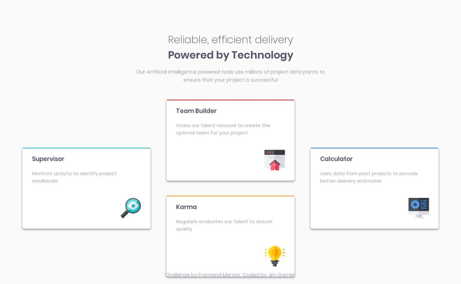
Design comparison
SolutionDesign
Solution retrospective
Hi guys, very new to all this, so please feel free to leave some feedback - it'd be greatly appreciated.
Thanks,
Jim
Community feedback
- @adarshcodesPosted over 4 years ago
Hi! @Jim, First of all, Welcome to this amazing community of learning Developers💖 Let's see your overall solution and start learning with each other🙂
- Okay, so firstly talking about your design- Your design looks fine but the thing you can change is:
- You can change the shadows of the card as per the design.
- Add margin-top to the footer and remove the
position: absolute;from the footer.
- Let's see the responsiveness- Okay, so your responsiveness works well but, you can change a few things:
- Add space between the cards in a responsive state. The cards stack over each other.
- Add one more breakpoint for responsiveness at 450px around so that the mobile view will be great.
- About your code:
- Great👍 your code is clean and easy to understand.
- Accessibility and HTML issues-
- NO Issues, nice🙂
Keep Coding🐱💻
2
Please log in to post a comment
Log in with GitHubJoin our Discord community
Join thousands of Frontend Mentor community members taking the challenges, sharing resources, helping each other, and chatting about all things front-end!
Join our Discord
