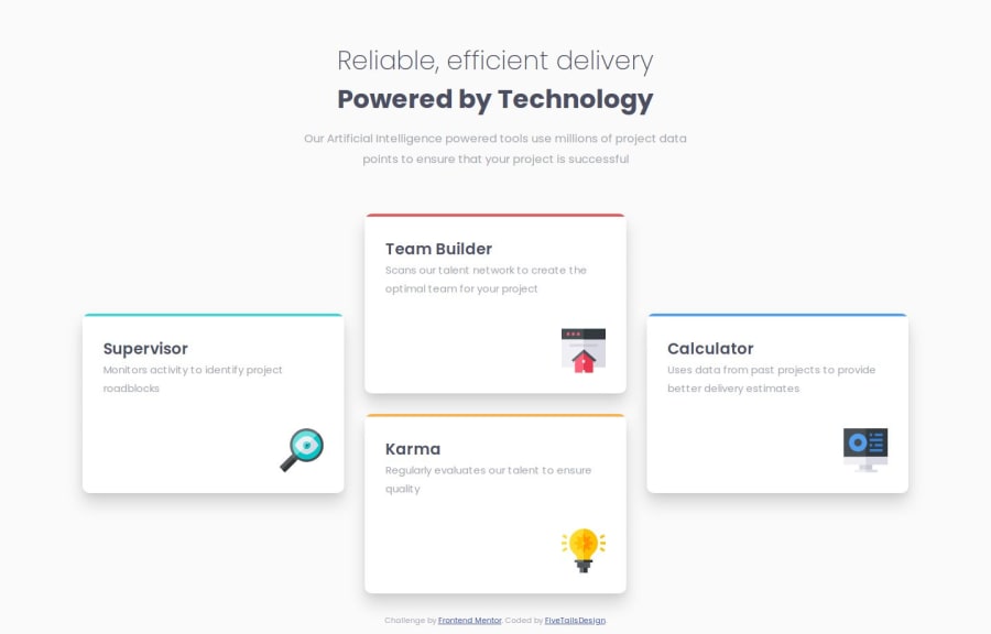
Design comparison
SolutionDesign
Solution retrospective
What are you most proud of, and what would you do differently next time?
I was happy with how this turned out, especially figuring out how to change the title colour on hover to match the coloured line at the top of the container.
There is probably be a better way to reduce the amount of code used.
What challenges did you encounter, and how did you overcome them?No major issues, other than figuring out the right size to use without Figma files.
What specific areas of your project would you like help with?None for this challenge.
Please log in to post a comment
Log in with GitHubCommunity feedback
- @JoyObaidu
Nice One even without figma👍
Join our Discord community
Join thousands of Frontend Mentor community members taking the challenges, sharing resources, helping each other, and chatting about all things front-end!
Join our Discord
