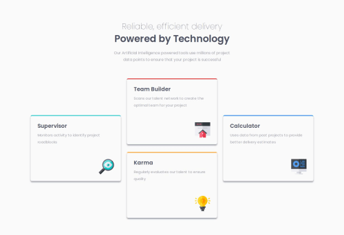
Submitted over 1 year agoA solution to the Four card feature section challenge
Four Card Feature
@teuthix

Solution retrospective
What are you most proud of, and what would you do differently next time?
I am proud of how I got the site to look similar to the provided design. Next time I just hope to get there faster.
What challenges did you encounter, and how did you overcome them?I spent a while unsure if I should be using grids or flexbox and kept restarting trying to figure out this site with grids. Ultimately I settled on flexbox though I'm not sure if this was the correct choice!
What specific areas of your project would you like help with?Is it possible to do this with grids or was flexbox the right move? Also any help appreciated!
Code
Loading...
Please log in to post a comment
Log in with GitHubCommunity feedback
No feedback yet. Be the first to give feedback on wey song's solution.
Join our Discord community
Join thousands of Frontend Mentor community members taking the challenges, sharing resources, helping each other, and chatting about all things front-end!
Join our Discord