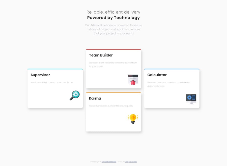
Design comparison
Solution retrospective
This is my very first Frontend Mentor challenge. Still very new to all of this, so please feel free to provide constructive feedback. Thanks everyone!
Community feedback
- @mattstuddertPosted about 5 years ago
Nice work, Cory, and congrats on submitting your first solution to the platform. I hope you enjoyed the challenge! You've done a really good job. There are just a couple of small tweaks I'd recommend making:
- Play around with the
box-shadowon the cards to try matching it up to the design - At tablet screen size, the layout goes a little bit funky. You could take a look at that and put the cards in a vertically aligned 2-by-2 grid before going down to a single column for mobile.
I hope that helps. Keep up the great work! 👍
0@CoryRunnPosted about 5 years ago@mattstuddert Thank you for the feedback! I'll take a look at your suggestions.
0@CoryRunnPosted about 5 years agoI went ahead a made your recommended changes @mattstuddert. Totally forgot about the box-shadow the first time around. For the tablet layout, I used
display:gridfor the first time ever. Pretty easy to use!Thanks again for the feedback!
1@mattstuddertPosted about 5 years ago@CoryRunn you're welcome, Cory. Nice work with the changes! Grid is great! 🙌
0 - Play around with the
Please log in to post a comment
Log in with GitHubJoin our Discord community
Join thousands of Frontend Mentor community members taking the challenges, sharing resources, helping each other, and chatting about all things front-end!
Join our Discord
