Design comparison
SolutionDesign
Solution retrospective
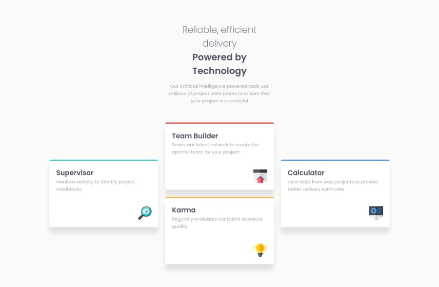
For this project, I practiced my knowledge of BEM methodology, I tried to follow a clean CSS structure with section comments and used semantic HTML tags.
For the challenge, I firstly designed it for mobile flow, using flexbox for that; and then adjusted the design for desktop using CSS grid. I also tried for the first time using clamp() to adjust the width and make it more responsive.
Feel free to make any suggestions about this or any part of the code. Thanks and happy coding!
Community feedback
Please log in to post a comment
Log in with GitHubJoin our Discord community
Join thousands of Frontend Mentor community members taking the challenges, sharing resources, helping each other, and chatting about all things front-end!
Join our Discord
