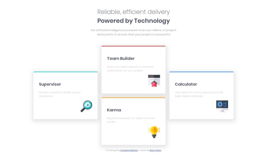
Design comparison
Solution retrospective
This was my first time using CSS Grids. It worked out ok I think but you have any suggestions or improvements to they way I've used them that would be great.
Also I couldn't get the shadows looking exactly like the ones in the design so suggestions on how to improve that would be appreciated.
Community feedback
- @vasily-mishaninPosted over 4 years ago
Nice for coding layout "by eye". Now I want to try CSS Grid
0 - @mattstuddertPosted over 4 years ago
Hey Ryan, nice work on this challenge. Your Grid implementation looks good! Grid Areas are an awesome feature in CSS Grid, so it's definitely worth getting used to them.
With the shadows, I'd recommend just playing around with the values to move it down a little and change the color of it slightly to match the design. In the "real-world" you'd obviously have the design file to get the exact values. They are available to purchase for these challenges but are not required unless you're looking to match up your solution exactly.
Quick question: Have you ever tried using
min-width
media queries instead ofmax-width
? It's quite a common workflow with front-end developers to use them and work mobile-first. It can often lead to less CSS code and has the benefit of loading in fewer styles for mobile users, which can be a nice performance gain. It could be worth trying out on a future project.I hope that helps. Keep up the great work! 👍
0
Please log in to post a comment
Log in with GitHubJoin our Discord community
Join thousands of Frontend Mentor community members taking the challenges, sharing resources, helping each other, and chatting about all things front-end!
Join our Discord