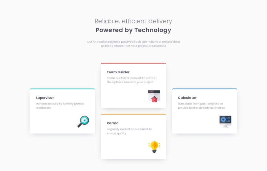


Design comparison
SolutionDesign

Solution retrospective
What challenges did you encounter, and how did you overcome them?
Relearning grid was tricky. I wanted to build the grid without media queries but couldn't figure out how to make the columns responsive whilst using grid-row and grid-column on the grid items. That breaks the trick of using repeat(auto-fit, ...). I ended up having to use a media query but I got away with only one. Below that breakpoint the grid is responsive.
The whole .card-grid class. Is there a better, cleaner way I could've built the layout in the design?

Join our Discord community
Join thousands of Frontend Mentor community members taking the challenges, sharing resources, helping each other, and chatting about all things front-end!
Join our Discord