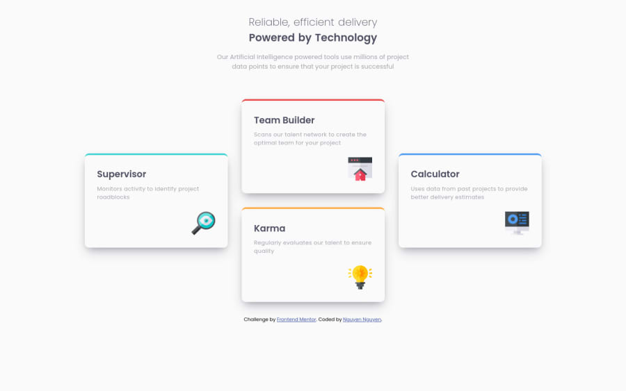
Four Card Feature (using Grid with 3 columns, bonus: active state)
Design comparison
Solution retrospective
I'm getting more comfortable using grid. Also I spent time updating the readme.md file and I'm proud of it. I'd love to receive feedbacks on anything.
Some specific questions I have are: 1- any other way to make this design work? using grid or not using grid? 2- what would you do differently for the box-shadow, that makes it look closer to the design? 3- how do you like the active state that I added for the cards? :D
Happy coding!
Community feedback
- @mjbagaPosted almost 3 years ago
Hi, Nguyen. Good job on the challenge.
Your questions:
- I'd use grid as well, much easier with grid-template-columns/rows or grid-template-areas.
- I suggest maybe add a transition effect on your hover for nicer micro-interactions. Something like
transition: box-shadow 500ms ease-in-out;. Also maybe less shadow spread so it doesn't cover up any other elements (unless intended).
Hope this helps. Happy coding!
Marked as helpful0 - @JohndiddlesPosted almost 3 years ago
Hi Nguyen, this is nice. I like it.
about your questions, I'll probably go with grid because it'd be easier for me to move things around with grid. But you can sure get this same task done using flexbox. My solution to this task was done with flex and it was very is easy getting it done. Secondly, like Marvin said, you can add some transition effect to the hover effect.
But still, nice work. Keep coding......cheers 🍻 🥂
1
Please log in to post a comment
Log in with GitHubJoin our Discord community
Join thousands of Frontend Mentor community members taking the challenges, sharing resources, helping each other, and chatting about all things front-end!
Join our Discord
