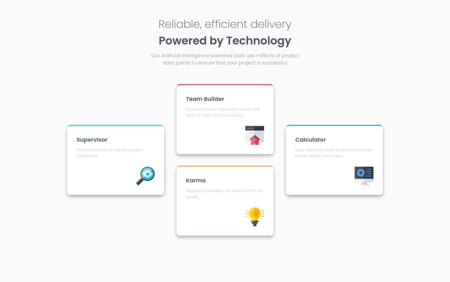
Design comparison
Solution retrospective
Any tips on how to improve my HTML or CSS would be appreciated :).
Community feedback
- @pikapikamartPosted over 3 years ago
Hey, really good work on this one. Looks really nice in desktop and mobile.
Though the breakpoint is too early. It is at pixel 1200px then you changed it up early to mobile state.
Suggestion would be that, since you are using grids right, it will be really awesome if you create a custom layout in those breakpoints, and not just for mobile layout. You can create like a matrix (2 x 2) items which is really cool and fits perfectly for small devices and after that breakpoint, is the mobile view. Because as you can see, when your breakpoint fires, there is this huge white space beside your grid. To which creates this feeling of empty for the website.
Creating that other breakpoint will be really good.
But still good work and your markup seems fine, no other extra elements used. Overall, really great job^^
0
Please log in to post a comment
Log in with GitHubJoin our Discord community
Join thousands of Frontend Mentor community members taking the challenges, sharing resources, helping each other, and chatting about all things front-end!
Join our Discord
