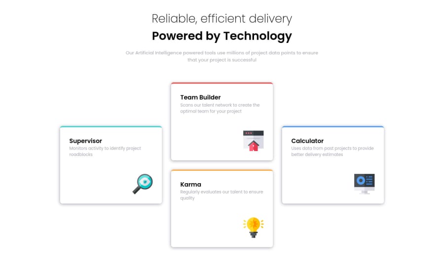
Design comparison
SolutionDesign
Solution retrospective
I couldn't seem to get the box shadow exact, what color was I supposed to use? I went with the grayish-blue. The shadow on mine also seems a bit harsher than the one in the photos.
Community feedback
- @VCaramesPosted almost 2 years ago
Hey there! 👋 Here are some suggestions to help improve your code:
- To properly center your content to your page, you will want to add the following to your
body
element (this method uses CSS Grid):
body { min-height: 100vh; display: grid; place-content: center; }
More Info:📚
- The
main
element should onlybe wrapping the card section, since this is the main content of your page.
- The intro heading and paragraph should be wrapped inside a
header
element.
- The “Reliable, efficient delivery Powered by Technology” is one single heading so the entire thing should be wrapped in a single
h1
heading along with aspan
element.
- Your use of headings is incorrect since the
h1
heading can only be used once. In your case, you used it multiple times.
- Along with the blank
Alt Tag
, you also want to include thearia-hidden=“true”
to your “icons” to fully remove them from assistive technology.
- Using
CSS Grid
withGrid-Template-Areas
will make things way easier when building the layout; it will give you full control of the layout.
Here is an example of how it works: EXAMPLE
- It is best practice to use, classes for your naming convention as classes are reusable, making them ideal for CSS styling. IDs on the other hand, are not reusable and are mainly used for JavaScript.
If you have any questions or need further clarification, feel free to reach out to me.
Happy Coding!🎄🎁
0 - To properly center your content to your page, you will want to add the following to your
Please log in to post a comment
Log in with GitHubJoin our Discord community
Join thousands of Frontend Mentor community members taking the challenges, sharing resources, helping each other, and chatting about all things front-end!
Join our Discord