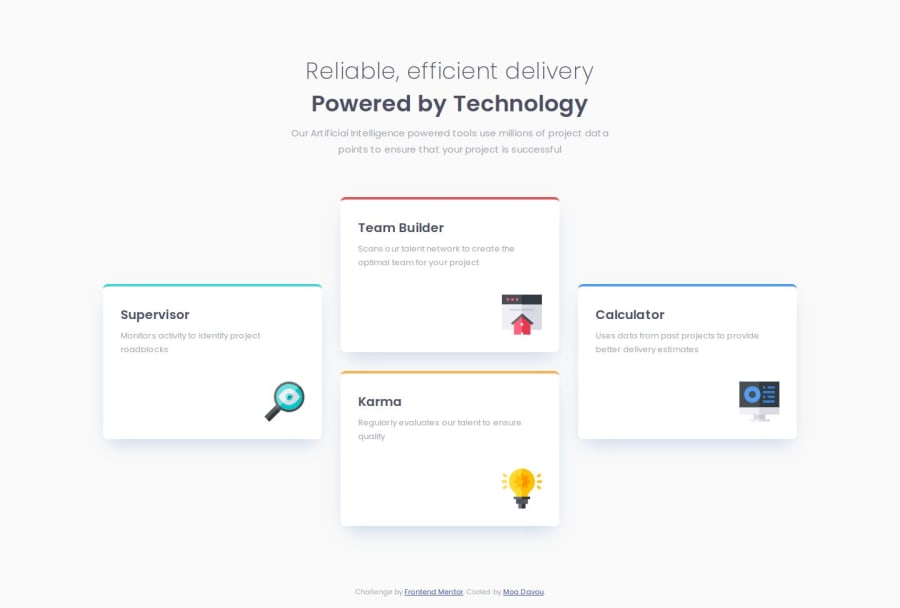


Design comparison

Solution retrospective
This project involved a lot of practicing what I already knew, which is always a valuable experience. However, I did manage to learn something new.
-
I practiced using
gridmore. I'm less confident with it compared toflexbox. I had some layout issues because I forgot aboutplace-items: center;. Managed to figure it out in the end! -
I also learned how to use the
data-*attribute to write shorter and cleaner CSS.
Any suggestions and comments on how I can improve are welcome!
Community feedback
- @R3ygoskiPosted 12 months ago
Hello Moa, congratulations on completing your project! It looks spectacular and closely resembles the proposed design.
I'd like to offer some tips regarding your semantic HTML. For example, you have a
<div class="header | text-align-c">, The correct approach here would be to use a<header>tag instead of a<div>, as it not only improves accessibility but also aligns perfectly with the concept of using thisdivas a header. Additionally, for the<div class="cards | grid fs-300">you could use an<article>because it's self explanatory content.Once again, congratulations on your project! It's very well done indeed. If Something that I said was unclear, please, feel free to comment bellow and I will try to help in the best possible way.
Marked as helpful2P@moadavouPosted 12 months ago@R3ygoski Thank you for the response, this is very helpful feedback!
1 - P@kaamiikPosted 12 months ago
Congrats for doing this challenge. This is a Grid challenge and It is a good practice.
Your html structure is really good and the way you write your css is great. If you have any good source to learn this way please share with me. I think It is a cube css.
I see some suggestions that other mentors tell to me also :) :
-
Never put text in span or divs.
-
You put your h1 and p tag in a main and it's completely right. I see someone told you to put it in a header tag. The header should not have a h1.
-
This challenge is a grid with 4 rows and 3 columns. I made a mistake too on this and Grace and Alex told me about this. There is a post on this that Alex explains why It should be for rows instead of two.
-
There are some ways to put your footer at the bottom. you can use
display: flexwithflex-growproperty or you can usemargin top: auto. Recently I read this post about how put your footer at the bottom of the page. you can use it too.
Marked as helpful1P@moadavouPosted 12 months ago@kaamiik Thank you for your response!
I do use CUBE CSS. But I'm not very good at it yet - currently learning! Look up Kevin Powell on YouTube. He helped me a lot. This TED Talk by Andy Bell is also amazing.
1 - This makes no sense to me.
spanis an inline-level container used to apply styles or scripting to a piece of text or a section of content. I guess doing it withdivis sub-optimal since it's a block-level container. But I didn't do it withdiv.2 - Same as above. Makes no sense. Why can't I put my
h1inside aheader? Isn't it quite common to use anh1tag within aheaderelement to mark the main heading or title of a webpage?3 - I guess it's possible to do this with 4 rows and 3 columns. But I think 3 columns and 2 rows are more clear (at least for me). Do you have a link to this post so that I can reference it?
4 - I don't understand what you mean with this. My
footeris kept at the bottom of the page (as long as the screen isn't over 1000px tall). I didn't setheight: 100vhon themainfor this one because I didn't really feel the need to. Most screens will have the footer at the bottom. And if it moves up on bigger screens I don't mind.0P@kaamiikPosted 12 months agoThanks for the good references I will check them all.
For the number 1 and 2 the reason is accessibility. When you add text inside div and span It's meaningless to screen readers. And for number 2 I read this If the page contains h1 element and either a main or banner landmark, the h1 element must be a child of either the main or banner landmark. I must say that all of these tips I've heard from mentors when they review my solutions.
For the Grid you can check this link Four card feature Grid layout
And for the footer I checked your page when is bigger than 1440px and the footer was at the middle of the page. If It's ok no matter :)) @moadavou
1P@moadavouPosted 12 months ago@kaamiik Thank you for your response, discussions like this are really great learning opportunities! 🙏🏻
I still can't find any resources that state that screen readers omit text inside
<span>elements as meaningless. Do you have any references? I prefer to understand something before I use it, and I still don't understand why I can't do this.Regarding your link for number 2, it states:
"An
h1heading can also be used (but not required) to provide a label for the website and when it is used for this purpose it should be placed in thebannerelement."And MDN states: "The <header> element can define a global site header, described as a banner in the accessibility tree."
So this is simply not true.
Thank you for providing the link to the Discord discussion! This makes sense. Especially if you want to future-proof your code. I'll keep in mind to use
grid-template-rowsinstead of columns In places where the length of the text can change the layout in ways I don't want.Regarding the
footer, Different sizes of screens are quite hard to accommodate. I really thought I tested all the options with my dev tools - but apparently not! Thanks for the input!0P@kaamiikPosted 12 months agoYou're welcome. These discussions are personally very valuable to me as well. Thank you.
About spans I've searched a lot on web and Generally, it's acceptable for me that there are some meaningful elements like
p,h1-h6,emandstrongfor using text inside and we can use them but maybe sometimes we have to use span. But on the other hand you are right and I wanna ask this on discord that why exactly we can't use text insidedivandspan. it's now a big question for me too :)For the
h1andheaderYou are right. If the header consider as abannerso we can useh1inside it. َFor the footer I randomly saw it And It is also a question for me that we should consider big sizes like tv screens or not. Other than that, I didn't see any other issues with your layout. @moadavou
1P@kaamiikPosted 12 months agoHere I asked Grace about these problems
you can read the answers. As I see there are some complicated reasons and different Ideas about accessibility problems. Personally I think we can learn more about accessibility by doing more projects and try to take notes about them. this is the best solution for me. @moadavou
1P@moadavouPosted 12 months ago@kaamiik Here is my conclusion from these discussions (here and on Discord) for future reference:
Using
<h1>inside<header>Even though multiple websites state that
<header>can contain<h1>(it's not a compliance failure under WCAG accessibility requirements), they shouldn't.<header>is a banner role landmark, which is designed to hold repeating content across a site.- If a banner
<header>with a<h1>is on every page, the<h1>no longer acts as a page heading due to it being perceived as repeated content. This is bad for SEO. - It can cause misordering of heading elements which is confusing for screen readers and goes against WCGA best recommendations.
Another thing to note is that having multiple
<header>elements on a page should be avoided. This makes some screen reader users hear multiple banner landmarks.Text inside
<span>or<div><div>and<span>have no semantic value. If semantic elements are used to give them semantic value, text can be used inside them. For example:<p><span>I'm a span</span>I'm not a span</p>Avoid standalone
<div>and<span>. For example, this is considered bad (due to no semantic value):<span>I'm a span</span>Make sure to use the most meaningful elements for the content.
- If you need bold text, use
<strong>or<bold> - If you need italics, use
<em>or<i> - If you need strikethrough, use
<del>or<s>
Only use
<span>if there are no meaningful elements you can use.1P@kaamiikPosted 12 months agoIt's a great summary of this long discussion. Thank you for writing this. It was very helpful for me and now we know exactly why we should avoid these mistakes. @moadavou
1 -
- @sivaprasath2004Posted 12 months ago
Hello, I would like to extend my congratulations on completing this challenge.
- Amazing solution. Look like a pixel perfect nice ...!
1


Please log in to post a comment
Log in with GitHubJoin our Discord community
Join thousands of Frontend Mentor community members taking the challenges, sharing resources, helping each other, and chatting about all things front-end!
Join our Discord