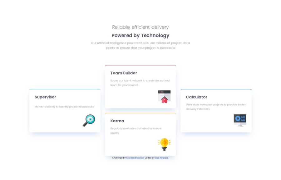
Design comparison
Solution retrospective
Most proud of using both CSS and Flexbox.
What challenges did you encounter, and how did you overcome them?Some challenges where just figuring out spacing, padding and margin. Trial and error helped me overcome that.
If there's a better way of writing the HTML or if this is fine.
Community feedback
- @TarestaPosted 5 months ago
You did a great job. Your final version is almost identical to the design. I learned quite a lot from your code. I am not an expert, so I can not say for sure, but your HTML structure looks good and well-organised. I loved how you used Flexbox for the smaller screen and switched it to a grid structure for larger screen sizes making good use of these layout algorithms. Keep up the good work.
Marked as helpful0
Please log in to post a comment
Log in with GitHubJoin our Discord community
Join thousands of Frontend Mentor community members taking the challenges, sharing resources, helping each other, and chatting about all things front-end!
Join our Discord
