

Design comparison

Solution retrospective
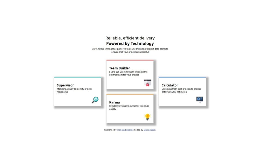
Used CSS Grid, had struggled to implement it with flex without changing position of divs. after research came to realize grids are best when dealing with both rows and columns while flex is best when dealing with either separately. The two can however be combined.
that exercise was great! drove me nuts, but I have learnt more with that project
What challenges did you encounter, and how did you overcome them?began with flex, couldn't be able to reproduce the image, went to grid, had challenges adapting it to different screens, later on, resorted to mobile first where it begins as one column and then two, then the desktop design
What specific areas of your project would you like help with?still having challenges with divs, part of content (like header)is going out of the screen on smaller screens
Community feedback
Please log in to post a comment
Log in with GitHub
Join our Discord community
Join thousands of Frontend Mentor community members taking the challenges, sharing resources, helping each other, and chatting about all things front-end!
Join our Discord