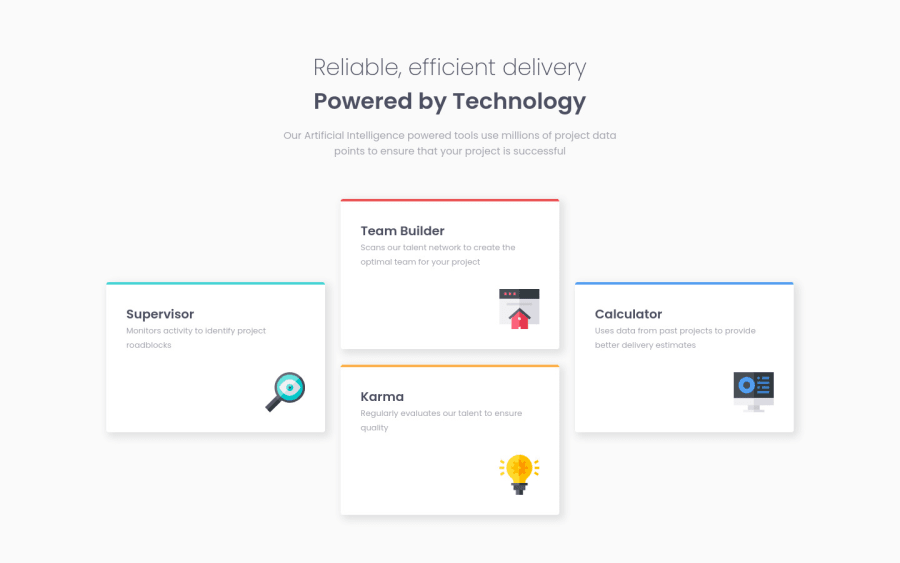
Design comparison
Solution retrospective
Hello!
This one was a fun ride discovering grid template areas :)
The card borders are a bit too big but I did not find a way to do exactly how I wanted, any ideas how to do it differently ?
Cheers, peninoule
Community feedback
- @correlucasPosted about 2 years ago
👾Hi , congratulations on your first solution!
Great solution and a great start! From what I saw you’re on the right track. I’ve few suggestions for you that you can consider adding to your code:
1.The colored bars are a bit too bit, try a value around
height: 8px2.Improve the semantic replacing the
<div>used for the four cards and use instead<article>that is a better tag, remember that<div>doesn’t have any effective meaning is just a block elements, so for big block of elements use semantic tags.This a good resource to understand more about
semantic tags:https://www.w3schools.com/html/html5_semantic_elements.asp3.The value you’ve used for the shadow make it too much dark and strong, to create a smooth shadow you need to give it less
opacityand moreblurtry this value for example:5px 5px 12px 3px rgb(0 0 0 / 4%);`✌️ I hope this helps you and happy coding!
Marked as helpful0@peninoulePosted about 2 years ago@correlucas Hey, thanks for the feedback!
Thanks for the tips about the box-shadows and the semantics, I'm going to have a look :)
I do have one last question tho: Do you know why the cards in the solution screenshot seem so off and not the right size? When I look at the live site, everything is the same size :s
Thanks again!
1
Please log in to post a comment
Log in with GitHubJoin our Discord community
Join thousands of Frontend Mentor community members taking the challenges, sharing resources, helping each other, and chatting about all things front-end!
Join our Discord
