

Design comparison

Community feedback
- @AdrianoEscarabotePosted 3 months ago
Hello ujwal282, how are you? I was really pleased with your project, but I’d like to offer some advice that might help:
I noticed that you use more than one h1, this is not a good practice since it is recommended to have only one h1 per page to inform the main title of the page! so remove all h1 and put h2
Consider using
remfor font size .If your web content font sizes are set in absolute units, such as pixels, the user will not be able to re-size the text or control the font size based on their needs. Relative units “stretch” according to the screen size and/or user’s preferred font size, and work on a large range of devices.if you want to continue coding with
px, you can download a very useful extension in vscode, it convertspxtorem!link -> px to rem
The rest is spot on.
Hope it’s helpful to you. 👍
Marked as helpful0 - @PsalmorgPosted 4 months ago
Using
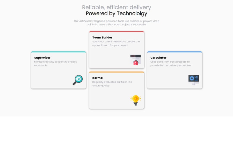
<header><h1><span> Reliable... </span><strong> Power.... </strong></h1></header>will be more semantic than usingdivas the header. i check your code and seesvg path, i know is for creating lines but what did you use it for in your code? Great work though0


Please log in to post a comment
Log in with GitHubJoin our Discord community
Join thousands of Frontend Mentor community members taking the challenges, sharing resources, helping each other, and chatting about all things front-end!
Join our Discord