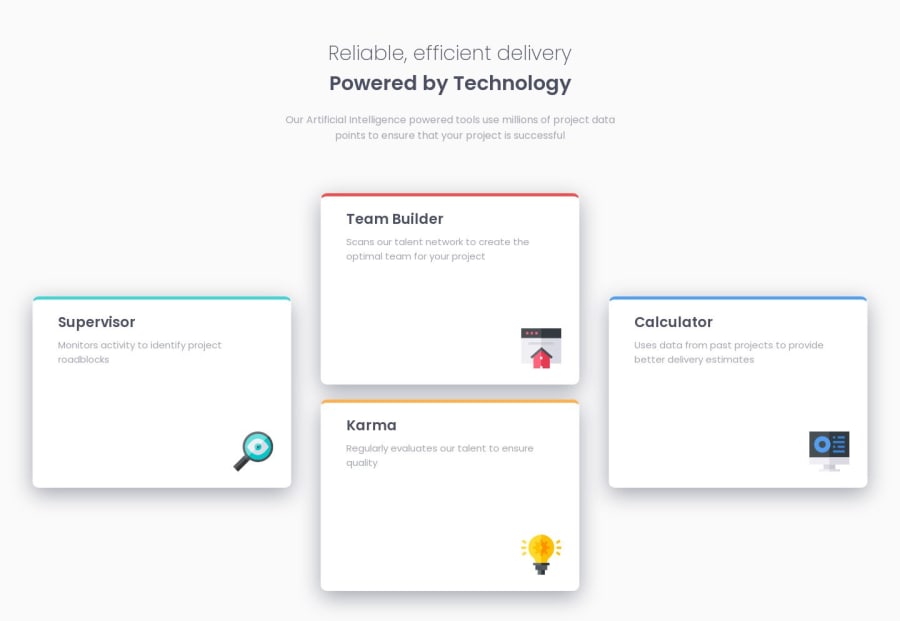
Four card feature solution using flexbox and grids.


Design comparison

Solution retrospective
I had quite some trouble putting the images in the correct position. I ended up padding them into place. It worked but I am not sure this is the best solution moving forward. Any feedback would be very much welcome. Thank you in advance.
Community feedback
- @LouckoomPosted 3 months ago
You can use two differents div for your cards, one for text part (including the two text) and one only for the icon (including the svg), then you can use css property "display:flex;" and "flex-direction: column;" on both div then use the property "align-items : flex-end;" for the icon div (it will place the icon on the right part of the card) and "align-items: flex-start;" (it will place the icon on the left part of the card) for the text div. That how i did it. Appart from that, Congrat and Good work ! PS : if you don't know how to use flexbox, go to Flexbox Froggy it's very useful to learn.
Marked as helpful1P@mroungouPosted 3 months ago@Louckoom Thank you very much for the tip. When I did this challenge I was avoiding flex box at all costs but have since learned it. I will definitely check out Flexbox Froggy :)
1

Please log in to post a comment
Log in with GitHubJoin our Discord community
Join thousands of Frontend Mentor community members taking the challenges, sharing resources, helping each other, and chatting about all things front-end!
Join our Discord