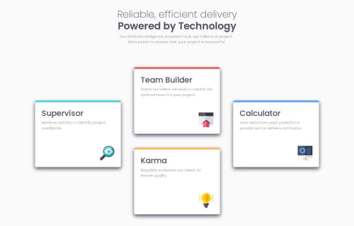
Four Card Feature Solution using CSS Flexbox and Bootstrap

Solution retrospective
Honestly I finished this product, with the thought of I could never or will never arrange the cards based on the outcome given. I TRIED TO FINISH THIS AS FAST AS I CAN! IT TOOK ME 2 WEEKS TO FINISH THIS (I took a day breaks in between to clear my mind because I could not understand a thing as the time goes by, so I have to refresh my mind with this one.) I will probably do the next challenges using mobile approach first as it makes it easier for me, I did approach this and my first other projects by designing large screen first that's why I had a hard time.
What challenges did you encounter, and how did you overcome them?Caaaaards! I had a hard time putting the karma card below the Team builder card. I had to redo my external CSS twice to understand what's happening. Tried to look for resources but somehow I have hard time understanding using the CSS grid i.e 1/2 2/3 (not sure with this tho)etc. I did my research and decided to use display:absolute for the card-karma and adjusted the transform:transitionY.
What specific areas of your project would you like help with?As you will notice when you transition into smaller screen my card-karma's width stayed the same unlike the other. Kindly, help me with automatic adjusting it with the same width as the other cards. Please. Also, any feedback will be appreciated. TYSM!
Please log in to post a comment
Log in with GitHubCommunity feedback
No feedback yet. Be the first to give feedback on Joewanaaa's solution.
Join our Discord community
Join thousands of Frontend Mentor community members taking the challenges, sharing resources, helping each other, and chatting about all things front-end!
Join our Discord