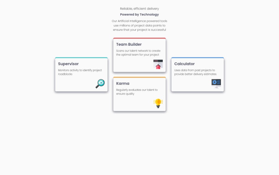
Four card feature session (CSS Grid, SASS, mobile first solution)
Design comparison
Solution retrospective
Great challenge for CSS Grid practice. I discovered grid-template areas that made the code much easier (from my point of view at least).
I also continued with SASS partials.
I would be grateful for any comments to my code and how can I improve my grid/sass parts. Could I make it somehow more readable than it is?
Thank you.
Community feedback
- @SemandrPosted over 2 years ago
Sorry for mi English, first of all... What I see....
- No classes for all tags
- .json for this simple project?
- What about fonts??
- Where is the mobile version? I'm newbie too, but... why upload unfinished challenge?
0@IvuskaPosted over 2 years agoHi @Semandr,
thank you for your comment.
- It is some kind of convention to have classes at all tags even though I can follow the design and style the page without using all of the classes?
- .json files are here because parcel is used for compiling the sass (I do not use @import command, but @use and @forward for sharing between the sass partials and parcel is compiling sass files "live" with auto-refresh).
- What do you mean with fonts? If I open compiled css file in DevTools I can see that "Poppins" is used as is defined in the style-guie.md file?
- I think that the solution is complete, not pixel perfect (especially on desktop), but is finished. If I open the page on mobile or in DevTools with Toggle device toolbar and set it to proper pixels I can see the mobile version...?
0@SemandrPosted over 2 years agoHi @Ivuska, I'll try to answer the questions in order:
- There is a technique called BEM methodology. It is used by many professional web developers. Its essence is to set the appearance of the element only through styles. Therefore, each element is assigned a style, according to the scheme: block - element - modifier. This is great stuff. This helps in both small and large projects. It also helps to easily expand the project without worrying that the layout of the page will "break".
- You can use an extension in VS-code that will do the same without needing to include a thing like Parcel.
- The size of the fonts and their thickness and color are very different from what the designer drew. This is a very significant difference.
- The layout of the page elements does not match the desktop version, they are not centered exactly in the center of the page, as suggested by the designer. As for the mobile version, everything is very bad there, since the elements are not displayed from top to bottom one after another, as provided in the layout, but are simply compressed and do not fit on the screen of a mobile device.
In conclusion. Try to look at materials on Flex and Grid - systems for the arrangement of elements and practice this. A lot of good links and materials are provided by both this site and YouTube. I tried to teach in this way + voluntarily bought three very inexpensive courses. But I repeat, there are a lot of materials with a detailed explanation here and on YouTube.
0
Please log in to post a comment
Log in with GitHubJoin our Discord community
Join thousands of Frontend Mentor community members taking the challenges, sharing resources, helping each other, and chatting about all things front-end!
Join our Discord