Four Card Feature Selection with CSS Multi-Columns and Semantic HTML
Design comparison
Solution retrospective
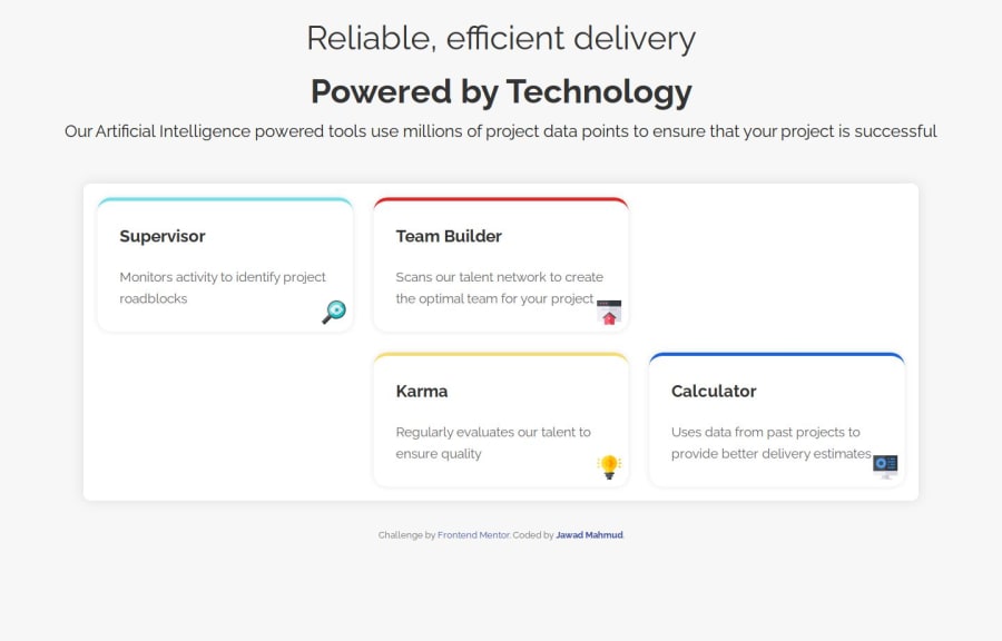
The part that I'm most proud of is having the chance to understand the logic behind multi-columns and being able to use consistent styling, effective use of CSS Grid, and responsive design. I have also made sure to use the grid layout to manage the card layouts easily.
What challenges did you encounter, and how did you overcome them?The main challenge that I have encountered is the alignment of the two cards in the first and third columns, When I tried to align them as expected, it only aligned with at least one card, rather than the center.
What specific areas of your project would you like help with?I would appreciate any help on how to keep the cards on the first and third columns, so that it is able to meet the design standard in any capacity.
Community feedback
- @MikDra1Posted 2 months ago
Nice one 😀
If you are curious how you can do this straight lines on the top of each card here is my tip:
Create another element in each of the cards. Then position this element absolute. Card should be positioned relative. At the end you need to give this element a height of 3px width of 100% and top 0 and left 0. You can also use ::after or ::before pseudo elements to create these.
Hope you found this comment helpful 💗
Good job and keep going 😁😊😉
Marked as helpful0 - @StroudyPosted 2 months ago
Amazing job with this! You’re making fantastic progress. Here are some small tweaks that might take your solution to the next level…
Bro I got you, What this does it puts each card between 2 rows,
-
Add this code snippet to your calculator
transform: translateY(-50%);
-
Add this code snippet to your supervisor
transform: translateY(50%);
-
Add this to your
<body>
,
min-height: 100svh; display: flex; justify-content: center; flex-direction: column;
- Using
max-width: 100%
ormin-width: 100%
is more responsive than justwidth: 100%
because they allow elements to adjust better to different screen sizes. To learn more, check out this article: responsive-meaning. - Developers should avoid using pixels (
px
) because they are a fixed size and don't scale well on different devices. Instead, userem
orem
, which are relative units that adjust based on user settings, making your design more flexible, responsive, and accessible. For more information check out this, Why font-size must NEVER be in pixels or this video by Kevin Powell CSS em and rem explained.- Another great resource for px to rem converter.
You’re doing fantastic! I hope these tips help you as you continue your coding journey. Stay curious and keep experimenting—every challenge is an opportunity to learn. Have fun, and keep coding with confidence! 🌟
Marked as helpful0@JawadM2002Posted 2 months ago@Stroudy Thank you so much for this tip, I will make sure to follow it, and thank you for the feedback :)
1 -
Please log in to post a comment
Log in with GitHubJoin our Discord community
Join thousands of Frontend Mentor community members taking the challenges, sharing resources, helping each other, and chatting about all things front-end!
Join our Discord