Design comparison
SolutionDesign
Solution retrospective
What are you most proud of, and what would you do differently next time?
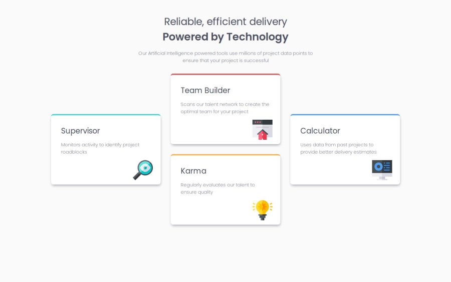
I had issues with placing the card divs in a + shape. I created three sub-divs and placed the center two cards in one div, then set the flex direction to row.
What specific areas of your project would you like help with?Community feedback
Please log in to post a comment
Log in with GitHubJoin our Discord community
Join thousands of Frontend Mentor community members taking the challenges, sharing resources, helping each other, and chatting about all things front-end!
Join our Discord
