Submitted almost 3 years agoA solution to the Four card feature section challenge
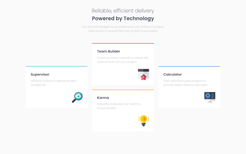
My Four Card Feature Section Solution Using Grid
@lndbgaa

Solution retrospective
Just one question : How can I do the shadow under the cards?
I'm open to any other suggestions to improve my code ! 😃
Code
Loading...
Please log in to post a comment
Log in with GitHubCommunity feedback
No feedback yet. Be the first to give feedback on lndbgaa's solution.
Join our Discord community
Join thousands of Frontend Mentor community members taking the challenges, sharing resources, helping each other, and chatting about all things front-end!
Join our Discord