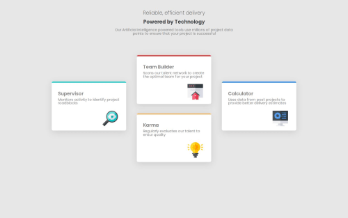
Four Card Feature Section

Solution retrospective
I am proud to have completed this project, and I really liked the outcome and how much I learned while doing it. Next time, I will study positioning with grid layout more thoroughly.
What challenges did you encounter, and how did you overcome them?Initially, I had a lot of difficulty with CSS Grid, but I found a developer named Fernanda Kipper on YouTube who provided a detailed explanation on how to use Grid effectively.
What specific areas of your project would you like help with?I would like to learn more about positioning elements with CSS Grid. In this project, I used margin for some elements, but I think it's not the ideal approach.
Please log in to post a comment
Log in with GitHubCommunity feedback
No feedback yet. Be the first to give feedback on Gabriel Nascimento's solution.
Join our Discord community
Join thousands of Frontend Mentor community members taking the challenges, sharing resources, helping each other, and chatting about all things front-end!
Join our Discord