Submitted 7 months ago
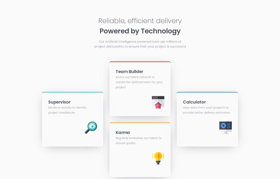
Four card feature section with responsive grid layouts
@MarenOelixtown
Design comparison
SolutionDesign
Solution retrospective
What are you most proud of, and what would you do differently next time?
👉 I created suitable grid layouts for different devices for having a responsive design. 👉 This time I did not import the font from google fonts as a link but integrated it directly in the project as a local woff2-file and embedded it in the css with @font-face.
What specific areas of your project would you like help with?I would also like to keep an eye on accessibilty design for future projects. If anyone knows of any useful info pages, I would be happy to hear about them.✌️
Please log in to post a comment
Log in with GitHubCommunity feedback
No feedback yet. Be the first to give feedback on Maren Ehlers's solution.
Join our Discord community
Join thousands of Frontend Mentor community members taking the challenges, sharing resources, helping each other, and chatting about all things front-end!
Join our Discord
