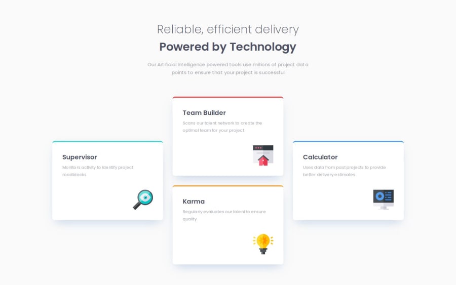
Four Card Feature Section with Next.js, Tailwind CSS
Design comparison
Solution retrospective
-
Implementing a more complex responsive design using CSS Grid, which allowed for a more sophisticated layout compared to previous challenges.
-
Successfully adopting a mobile-first approach in this project, which improved the overall design process and responsiveness of the site.
-
I've added a 2x2 card layout between the desktop and mobile views for a more natural responsive design, even though it's not defined in the design system. Please visit the site and check it out!
The main challenge I faced was implementing the desktop layout after initially using flexbox for the mobile-first approach. The desktop design proved more complex than anticipated. I overcame this by switching to CSS Grid for the desktop layout and then refactoring the existing code.
What specific areas of your project would you like help with?I'm curious about how others effectively utilize CSS Grid, especially given that Figma's dev mode only shows layouts in Flexbox. While I managed to implement Grid for this project, I'm interested in learning more about best practices for translating Flexbox-based designs from Figma into Grid-based layouts. Any tips or insights on this process would be greatly appreciated, particularly strategies for efficiently converting Figma's Flexbox layouts to Grid in actual code.
Community feedback
Please log in to post a comment
Log in with GitHubJoin our Discord community
Join thousands of Frontend Mentor community members taking the challenges, sharing resources, helping each other, and chatting about all things front-end!
Join our Discord
