Submitted almost 2 years ago
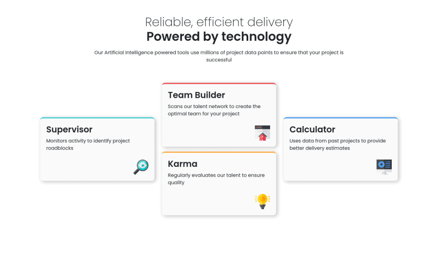
Four card feature section with HTML, CSS, SASS and Bootstrap
@rubenao
Design comparison
SolutionDesign
Community feedback
- @VCaramesPosted almost 2 years ago
Hey there! 👋 Here are some suggestions to help improve your code:
- To properly center your content to your page, you will want to add the following to your
bodyelement (this method uses CSS Grid):
body {
    min-height: 100vh;
    display: grid;
    place-content: center;
}
More Info:📚
- The “Reliable, efficient delivery Powered by Technology” is one single heading so the entire thing should be wrapped in a single
h1heading along with aspanelement.
- the main heading and paragraph need to wrapped inside a
headerelement and it needs to be outside themainelement
- The “icons” serve no other purpose than to be decorative; They add no value. Their
Alt Tagshould left blank and have anaria-hidden=“true”to hide them from assistive technology.
More Info:📚
https://www.w3.org/WAI/tutorials/images/
- Using
CSS GridwithGrid-Template-Areaswill make things way easier when building the layout; it will give you full control of the layout.
Here is an example of how it works: EXAMPLE
If you have any questions or need further clarification, feel free to reach out to me.
Happy Coding!🎄🎁
0 - To properly center your content to your page, you will want to add the following to your
Please log in to post a comment
Log in with GitHubJoin our Discord community
Join thousands of Frontend Mentor community members taking the challenges, sharing resources, helping each other, and chatting about all things front-end!
Join our Discord
