Submitted almost 4 years ago
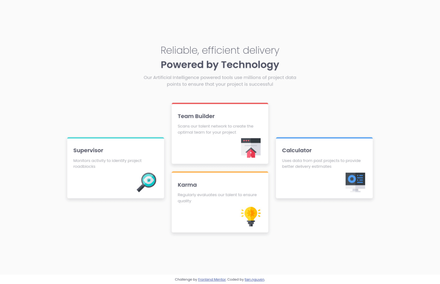
Four Card Feature Section with HTML, CSS and the use of grid + flexbox
@NiteArie
Design comparison
SolutionDesign
Solution retrospective
Any small improvement tips would be a huge help! Thanks in advance.
Community feedback
- @adarshcodesPosted almost 4 years ago
Hi @NiteArie, your solution is really looking great👏. The design is quite similar to the original design. A few things you can improve to make it better-
- add height to 100% to container remove 100vh, it distorts the layout while checking responsiveness.
- Add the footer inside the container, it is creating a white color background from the main section which is separating it in some way in design-wise.
- For better responsiveness, you can make the cards two-column layout for breakpoint nearly 750px and also add one more breakpoint at 500px. It would work amazing after these updates. Besides this thing I can't find anything much that you can work more on. Good work👍. Happy Coding : )
2@NiteAriePosted almost 4 years agoAppreciate the feedback. Will test and improve what I could with your tips. Thanks!
1
Please log in to post a comment
Log in with GitHubJoin our Discord community
Join thousands of Frontend Mentor community members taking the challenges, sharing resources, helping each other, and chatting about all things front-end!
Join our Discord
