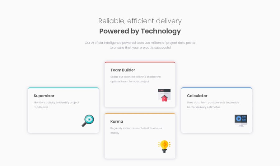
Design comparison
Solution retrospective
I did it with Grid instead of Flexbox. Maybe Flexbox is faster, but I wanted to practice with Grid. So please feel free to check out my solution and leave feedbacks. I'd really appreciate it!
Community feedback
- @stephenwbolgerPosted over 4 years ago
You have created an interesting solution. I can see you have put some effort into this. I think this design can be made to work with Grid, but it is faster and better to complete with Flexbox in my opinion. I like the 2x2 between mobile and desktop viewport width, which I did not include in my solution, which you can view at https://www.frontendmentor.io/solutions/four-card-feature-section-htmlcss-XPWlDidiD if you like. Keep going with the challenges. I look forward to seeing how you do.
0@maihuynh94Posted over 4 years ago@stephenwbolger Thanks Stephen. Ye, I see most people's solution here using Flexbox, which was a part of the reason why I chose Grid to see how it works, because I 've just learned Grid recently and I'm happy finally I made it look not too bad, at least not too much different from the challenge. But yea I agree with you that Flex is def so much faster. And sure I'll check your solution out to learn more from it. Happy coding and I look forward to seeing how u do too.
0 - @siddtheonePosted over 4 years ago
I think team builder and karma should always be together vertically. In case of 2X2 grid they aren't together vertically. Not sure how worthy this point is. In my solution with flex I took care of this.
0
Please log in to post a comment
Log in with GitHubJoin our Discord community
Join thousands of Frontend Mentor community members taking the challenges, sharing resources, helping each other, and chatting about all things front-end!
Join our Discord
