Design comparison
Solution retrospective
Easy one, I believe. How do you like it?
Community feedback
- @DanielArzaniPosted about 2 years ago
Hello 👋
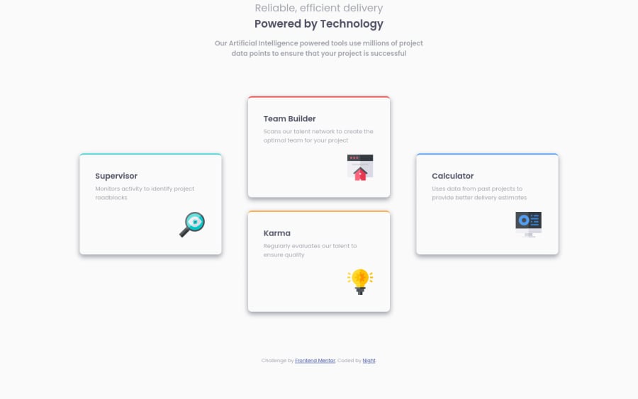
Congrats on finishing the project. Something I noticed when resizing my screen is that your cards didn't resize along with the screen (they didn't get squished as my viewport width got smaller), which is usually what is desired for responsive design. You probably set a fixed width on the outer container of your cards, this will cause an overflow on smaller screen sizes and will require people to scroll to the side if they want to view all of your cards.
A general rule of thumb is avoid height, max-height, width and min-widths, they make responsive design a lot harder
0
Please log in to post a comment
Log in with GitHubJoin our Discord community
Join thousands of Frontend Mentor community members taking the challenges, sharing resources, helping each other, and chatting about all things front-end!
Join our Discord
