Design comparison
Community feedback
- @ItsZubekPosted 5 months ago
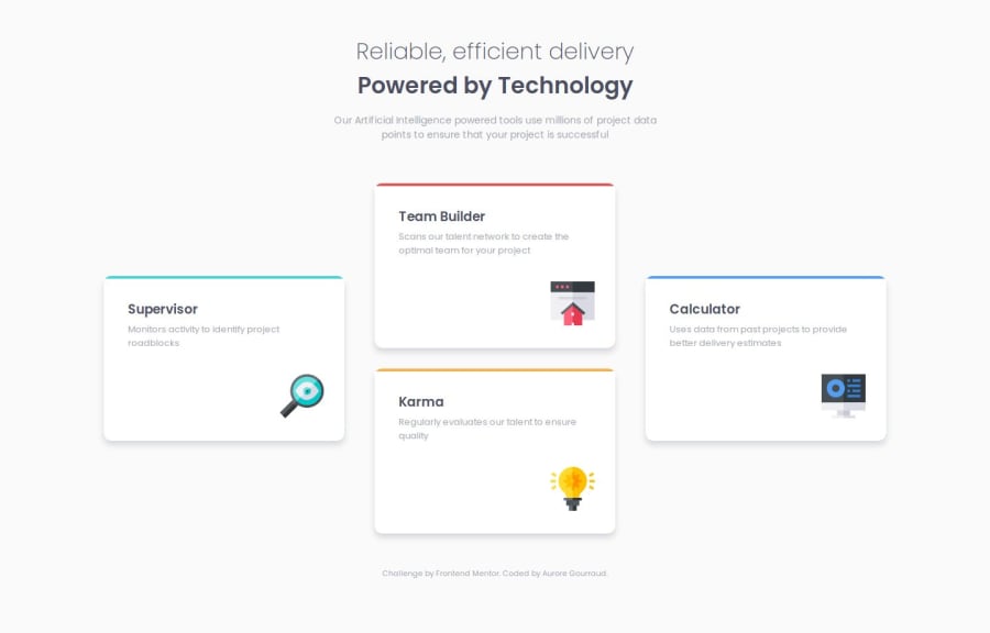
The cards themselves look very similar to the design. However I'm not sure if it's just on my monitor, but the horizontal spacing between the cards is completely off. I think if you've tried centering the whole design and adding a
gapproperty if you're using flexbox to space them out it would be okay. Another thing I've noticed is if you change the screen size to around700pxyou can see the background colours coming out from beneath the card itself. Other than that it looks good.0@AuroreTurtlePosted 5 months agoI've centred the elements and used the gap property. I'll take a look at it. Thanks.
0
Please log in to post a comment
Log in with GitHubJoin our Discord community
Join thousands of Frontend Mentor community members taking the challenges, sharing resources, helping each other, and chatting about all things front-end!
Join our Discord
