Submitted 7 months ago
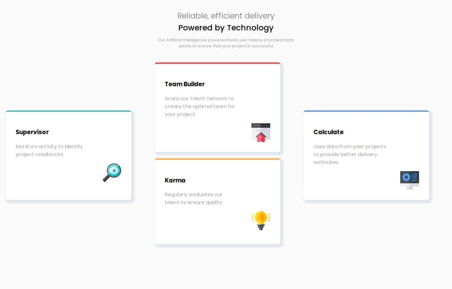
four card feature section with grid
#pure-css
@alshimaa-mhmd
Design comparison
SolutionDesign
Community feedback
- @wotanutPosted 6 months ago
An excellent attempt, well done. Here's how to improve your solution:
- Consider using an alternative to
<div>such as<article>to improve semantics and accessibility. - You can centre the whole block text inside your HTML like so
html,
body {
  margin: 0;
  width: 100%;
  height: 100%;
  display: grid;
  place-items: center;
}
This also includes some resets that you should be performing
- Consider using CSS variables to reuduce repetitive code and to make variables easier to modify. CSS Variables Tutorial
- Consider adding six grid areas instead of what you have now to make it easier to align such as
grid-template-areas: "one two three" "four five six";then addgrid-row: span 2;to your rows that need to span two or more rows and change the grid-area to be of this syntaxgrid-area: one / four;. This works as the text doesn't need to follow the same grid shape as the cards.
Well done though, an excellent attempt :)
Marked as helpful0 - Consider using an alternative to
Please log in to post a comment
Log in with GitHubJoin our Discord community
Join thousands of Frontend Mentor community members taking the challenges, sharing resources, helping each other, and chatting about all things front-end!
Join our Discord
