

Design comparison

Solution retrospective
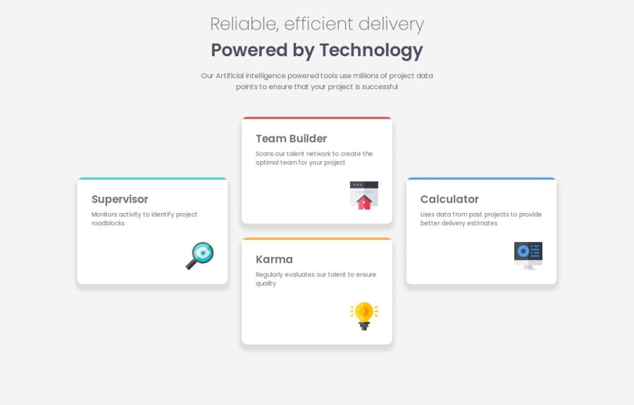
I'm particularly proud of creating a responsive grid layout that effectively arranges the four feature cards in both desktop and mobile views. The implementation of CSS Grid template areas made the layout both visually appealing and maintainable. For future iterations, I would enhance the project by implementing more CSS custom properties for better theme management, especially for color variations and spacing, which would make the code more flexible and easier to maintain. I would also consider adding subtle animations to improve user interaction and make the interface more engaging.
What challenges did you encounter, and how did you overcome them?Main challenge was creating a straight top border without affecting the card's rounded corners. Solved by using ::before pseudo-element with overflow: hidden, which provided a clean solution without compromising the design.
What specific areas of your project would you like help with?No immediate technical issues, but would appreciate feedback on:
- Grid layout optimization for more screen sizes
- Accessibility improvements
- Best practices for managing pseudo-elements
Community feedback
Please log in to post a comment
Log in with GitHubJoin our Discord community
Join thousands of Frontend Mentor community members taking the challenges, sharing resources, helping each other, and chatting about all things front-end!
Join our Discord