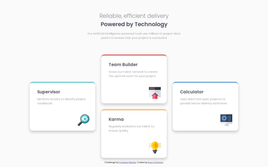
Four card feature section with CSS Grid and Flexbox


Design comparison

Solution retrospective
What I'm most proud of from this challenge is that I'm starting to understand to make a responsive website will involve using both CSS Grid and CSS Flexbox.
Learning that you can use grid-template-areas and use periods to take up space on the grid is a neat trick for being able to place elements in a cross formation like in this challenge.
What challenges did you encounter, and how did you overcome them?main{ display: grid; grid-template-columns: repeat(3, 1fr); grid-template-rows: repeat(4, 1fr); grid-template-areas: ".team-builder." "supervisor team-builder calculator" "supervisor karma calculator" ". karma ."; gap: 2rem; }
The main challenge I encountered was learning how to implement both CSS Grid and CSS Flexbox at the same time. Having to design custom CSS rules for both mobile and desktop really makes designing and using HTML elements extremely complicated that you feel like you need to create multiple or elements to solve the challenge as both Grid and Flex involves being able to use attributes for a parent-child relationship.
The way I overcame this was to use Grid for the webpage design and use Flexbox for the content. This is the practice I would like to move forward with to develop my knowledge of both Grid and Flexbox.
What specific areas of your project would you like help with?The area I would like help from with this project is understanding how to stop the text and images from being responsive using CSS.
I know I try and make an exact match of each challenge, but I can't stop the text from being responsive when the window size increases or decreases as seen in the mobile-design and desktop-design pictures.
I would also like help with figuring how to figure out how big or small containers should be for each challenge. Because either I make them responsive or set a specific size and I don't know what's the best practice.
Community feedback
- P@tunaertenPosted 9 months ago
Bravo, your project looks great. I had done mine using flexbox, but you did an excellent job with grid as well. The colored borders on the cards end in a straight line; to achieve this effect, you can add a pseudo-element and use the background color of the cards. This way, you can get a result that is a bit closer to the original. Although this project is small, I think it would be more beneficial to work with class names. Lastly, when the screen width is around 1100px, the sections of the first and last cards are off the screen, so maybe you can think of a solution for that too. Congratulations!
0

Please log in to post a comment
Log in with GitHub
Join our Discord community
Join thousands of Frontend Mentor community members taking the challenges, sharing resources, helping each other, and chatting about all things front-end!
Join our Discord