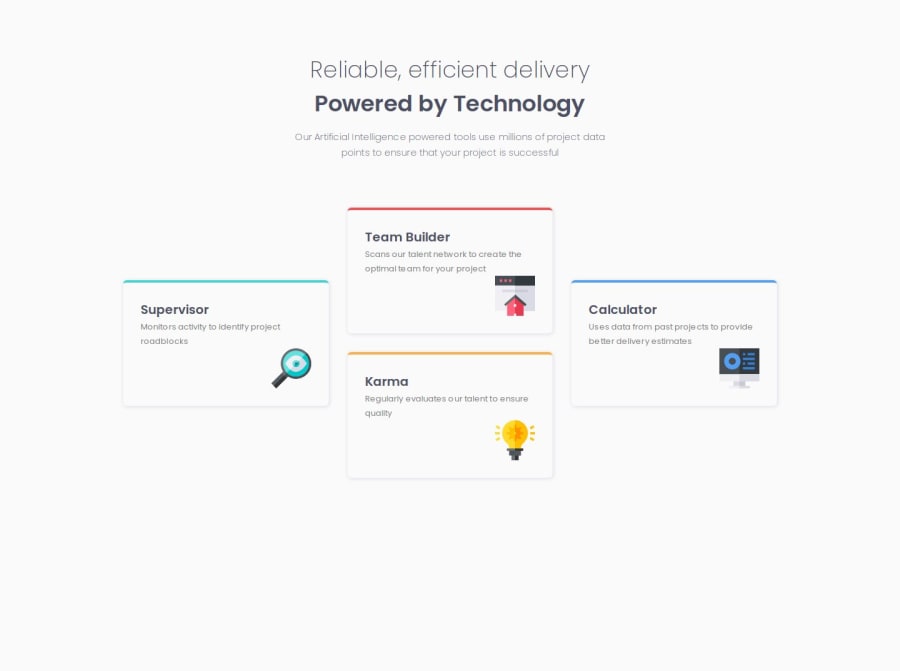
Design comparison
Solution retrospective
Getting the cards to layout correctly on the desktop version using grid. and centering content using grid
What challenges did you encounter, and how did you overcome them?centering content using grid and getting the cards to get to the layout.
What specific areas of your project would you like help with?I would like to know if using a div solely for centering content is the best method and any general advice about grid that you can see that I can improve on.
Community feedback
- @TheWizCoderPosted 10 months ago
well done doing this design. notes:
consider use semantic tags like <header> and <section> the size and background colorof the cards are different from the design
0
Please log in to post a comment
Log in with GitHubJoin our Discord community
Join thousands of Frontend Mentor community members taking the challenges, sharing resources, helping each other, and chatting about all things front-end!
Join our Discord
