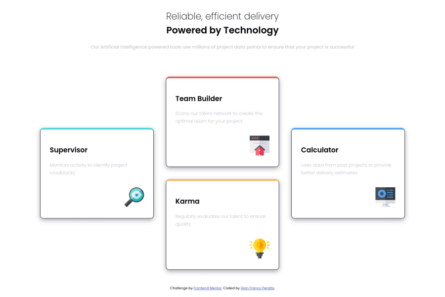
Four card feature section with css FLEXBOX AND GRID
Design comparison
Solution retrospective
Any feedback is appreciated :) PSDT: I don't know why I can't think of anything for the paragraph to be centered :(
Community feedback
- @pikapikamartPosted about 3 years ago
Hey, awesome job on this one. Layout in desktop looks fine, just the
borderon each card could be remove so that thebox-shadowwill be more visible, and thebackground-coloras well for thebodytag is not using the grey one like on the design. The mobile layout is great as well.For the center problem, what you could do is that, add a
max-widthon theptag that have text, adjust it to your preference and it will wrap the text like on the design.Some other suggestions would be:
- Both the text
Reliable, efficient deliveryandPowered by Technologycould have used just oneh1since it looks like that it is just one phrase. You could just wrap the second text inside adivand wrapped it in another row. - The
altvalues for the icons that you used should be left emptyalt=""since it is just a decorative image. - Just an idea, maybe you could make a 2x2 layout when transitioning to mobile layout. For example, the desktop layout have 3 colums for the cards right, and maybe resizing, you could make that 2x2 so that you don't just need to transition directly to mobile layout. Just an idea :>
Aside from those, markup looks good.
0 - Both the text
Please log in to post a comment
Log in with GitHubJoin our Discord community
Join thousands of Frontend Mentor community members taking the challenges, sharing resources, helping each other, and chatting about all things front-end!
Join our Discord
