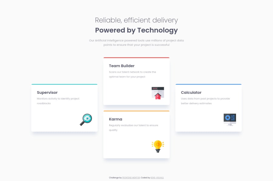
Four Card Feature Section with CSS Flexbox, CSS Grid, SCSS, and BEM
Design comparison
Solution retrospective
I've had a lot of fun building this project, and here is why 👇🏻
I've wanted to work on a project that will allow me to use both CSS Flexbox and CSS Grid at the same time, that will fit to the needs of the project harmonically. This project was the perfect candidate to achieve what I've wanted to do for a while. Moreover, this was a perfect project to use BEM convention. There are a lot of pieces that are technically the same, so BEM helped me to use its power to shorten my CSS, and of course BEM + SCSS makes both of them even more powerful.
P. S. I just wanted to spice things up a bit, so I added some hover effects 🙃
Feel free to leave some feedback 👨🏻💻
Community feedback
- @coding-tomatoPosted over 3 years ago
That hover effect is sick! Love how a very simple use of transform properties can give a page so much charm.
0P@kens-visualsPosted over 3 years agoThanks, @VeryEvilTomato. Yes, absolutely,
:hovereffects can make the page more interactive, if used correctly.0
Please log in to post a comment
Log in with GitHubJoin our Discord community
Join thousands of Frontend Mentor community members taking the challenges, sharing resources, helping each other, and chatting about all things front-end!
Join our Discord
