Four Card Feature Section with Basic HTML and CSS


Design comparison

Solution retrospective
choosing between grid and flex
What specific areas of your project would you like help with?i was wondering how to make this four card display using grid only
Community feedback
- @salilphadnisPosted 4 months ago
You may want to fix the link to your code as it says page not found. However, I was able to go up one level and back into the repository.
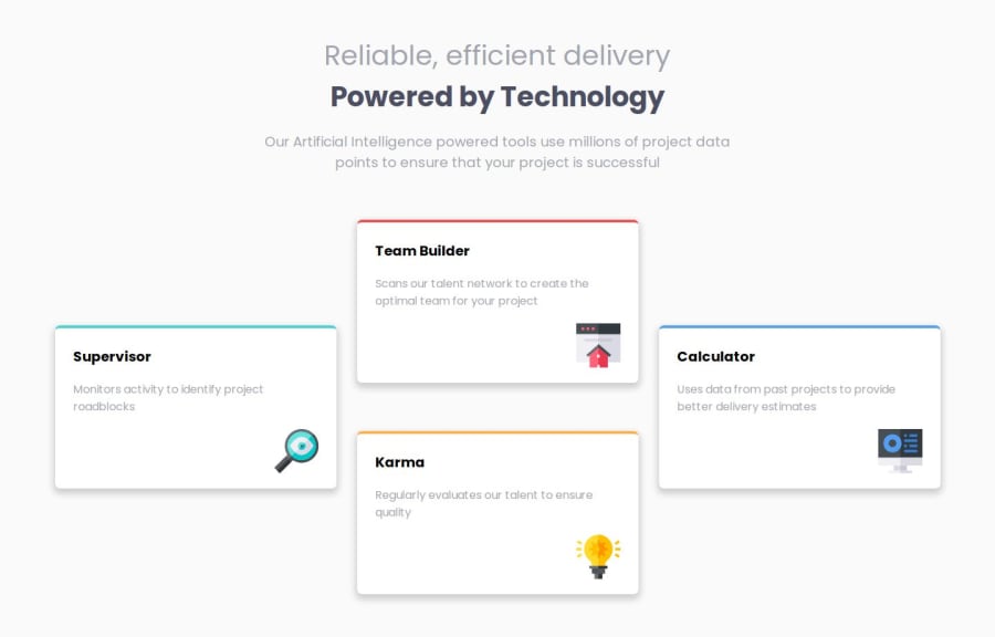
Your desktop design looks very good. However, I see that you don't have the mobile design. For this design, I found it easier to go with grid rather than flex. I first did the mobile design using 1 column grid for the cards. Then for the desktop design, using the media query @media (min-width: 768px), I changed the grid structure in to 3 columns and 4 rows and spread the cards as shown in the desktop design.
Here is my CSS for reference: https://github.com/salilphadnis/four-card-feature-section/blob/main/style.css
Marked as helpful1

Please log in to post a comment
Log in with GitHubJoin our Discord community
Join thousands of Frontend Mentor community members taking the challenges, sharing resources, helping each other, and chatting about all things front-end!
Join our Discord