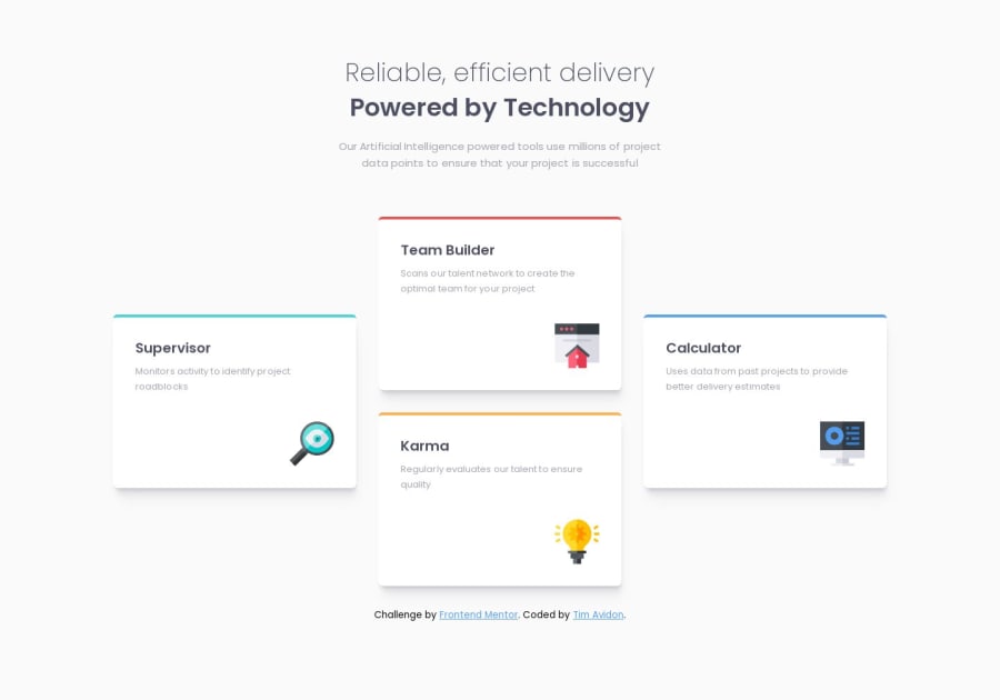
Four card feature section w/ (HTML + CSS)
Design comparison
Solution retrospective
I'm open to feedback and any suggestions on how to improve this solution or achieve better performance.
thanks.
Community feedback
- @PatrickNgabiranoPosted over 1 year ago
You nailed it. there's nothing much I can do, but it is really exciting. If you follow Bruce B., it would help to solve that small issue. Thanks. But don't give up just keep up with more practice. You will get there with sometime.
0 - @bbsmoothdevPosted over 1 year ago
You nailed this. Nicely responsive. Heading structure is great. It looks just like the original.
The only issue I can find is that the color contrast of the light gray text with the background is not high enough to be accessible. So in the real world you would need to increase the darkness of the text. But if the design you are emulating has inaccessible text then I am not going to fault you for following the design. But if that's the case, then the designer needs to learn a little about accessibility.
0
Please log in to post a comment
Log in with GitHubJoin our Discord community
Join thousands of Frontend Mentor community members taking the challenges, sharing resources, helping each other, and chatting about all things front-end!
Join our Discord
