Not Found
Not Found
Not Found
Not Found
Not Found
Not Found
Not Found
Not Found
Not Found
Not Found
Not Found
Not Found
Not Found
Not Found
Not Found
Not Found
Not Found
Not Found
Not Found
Not Found

Submitted

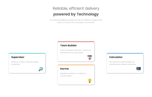
Four Card Feature Section

@StevetheRebel

Desktop design screenshot for the Four card feature section coding challenge

This is a solution for...

  • HTML
  • CSS
1newbie
View challenge

Design comparison


SolutionDesign

Solution retrospective


What are you most proud of, and what would you do differently next time?

It was an easy task to accomplish. Enjoyed it very much.

Community feedback

@SteveNoyes

Posted

Your code is well-structured and adheres to good practices, especially with the use of variables and Flexbox. Minor adjustments, like enhancing accessibility, refining media queries, and ensuring better responsiveness across various devices, will improve the overall quality and maintainability of the code.

The header section is well-styled, but using gap: 1rem and height: 30vh might create layout issues on very small screens. Consider using min-height instead of height to ensure the content doesn’t overflow on smaller screens.

The main section and its child elements use Flexbox, which is good for responsive design. However, using a fixed width like 30% for .col-ctn may cause layout issues on different screen sizes. Use flex-basis with min-width or max-width properties instead of a fixed width: 30% to allow better flexibility across screen sizes.

The box-shadow on the cards (2px 2px 10px var(--neutral-grayish-blue)) is subtle and may not be noticeable on certain backgrounds. Consider increasing the blur radius or opacity for a more pronounced effect, or adding a background color to the body or container.

The media query at max-width: 500px is a good start, but it might not cover all smaller devices or edge cases. Add another breakpoint, perhaps at max-width: 768px, to better handle tablet or small laptop screens.

The images have a fixed width of 2.5rem, which might not scale well on larger or smaller screens. Use responsive units like em, rem, or percentages, and consider max-width: 100% to ensure proper scaling.

Marked as helpful

0

Please log in to post a comment

Log in with GitHub
Discord logo

Join our Discord community

Join thousands of Frontend Mentor community members taking the challenges, sharing resources, helping each other, and chatting about all things front-end!

Join our Discord