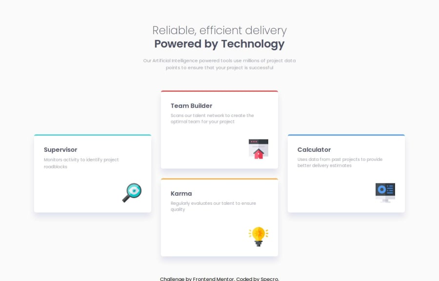


Design comparison
SolutionDesign

Community feedback
- @thomasweitzelPosted 5 months ago
Your solution looks great for me:
- Tailwind CSS configuration is clean and extends the base theme without unnecessary complexity
- Proper use of responsive utilities (
grid-cols-1,lg:grid-cols-3,lg:grid-rows-2,gap-6,md:gap-8) ensures that the layout adapts to different screen sizes - Perfect use of semantic tags like
<main>,<footer>,<h1>,<h2>, and<p> - Use of Tailwind's typography utilities (
font-semibold,font-extralight,text-xl) aligns with the design - The combination of
row-span-2andorder-lastdemonstrates an understanding of advanced CSS grid properties to achieve the desired layout; I had to look it up to get an idea of what it does ;-)
If I had to say one thing that I used myself: The
bg-${color}pattern wasn't used, and instead, colors likeborder-cyanandborder-redare hardcoded. I believe it's because you want to prevent Tailwind from purging the CSS. Consider using dynamic class generation with Tailwind'ssafelist. E.g. I had defined the primary colors intailwind.config.jsand then included this:safelist: [ { pattern: /(bg|text|border)-(primary-red|primary-cyan|primary-orange|primary-blue)/, },I really like your nice and clean implementation!
Marked as helpful0

Please log in to post a comment
Log in with GitHub
Join our Discord community
Join thousands of Frontend Mentor community members taking the challenges, sharing resources, helping each other, and chatting about all things front-end!
Join our Discord