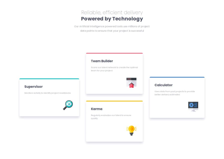
Four card feature section using Reactjs and Vanilla CSS
Design comparison
Solution retrospective
Hello, Frontend Mentor coding community. This is my solution for the Four card feature section.
A quick challenge that I finished in one day.
Every section I cover on react.js, I use the opportunity to build a simple small component. Therefore, I used functional components to build the projects
What challenges did you encounter, and how did you overcome them?I had a challenge with the first card on desktop. Therefore, I used an id to target only the style for desktop.
Please review and let me know where did I go wrong.
Community feedback
- @DarkstarXDDPosted 9 months ago
- A page should usually contain only one
<h1>heading. Change those headings inside the cards to be<h2>. - In your code some font-sizes are defined in
rem, some are defined inpx. Be consistent. Always useremfor font-size. - Don't use fixed heights on containers that contain text. Remove that
heighton the.card. The browser will calculate the needed height based on the content inside the container.
Marked as helpful0@nonozaPosted 9 months ago@DarkstarXDD I actually did change the heading element and rebuild, somehow it hasn't reflected. Thanks for the other input.
1 - A page should usually contain only one
Please log in to post a comment
Log in with GitHubJoin our Discord community
Join thousands of Frontend Mentor community members taking the challenges, sharing resources, helping each other, and chatting about all things front-end!
Join our Discord
