Submitted almost 3 years ago
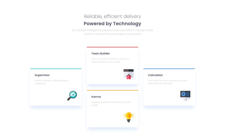
Four card feature section using only CSS flexbox

@Al-lien

Design comparison
SolutionDesign

Solution retrospective
Hi ! This one was cool to work on Next time i'm going to try to make it more responsive to screen size changes, any tips ?
Thanks
Community feedback
Please log in to post a comment
Log in with GitHub
Join our Discord community
Join thousands of Frontend Mentor community members taking the challenges, sharing resources, helping each other, and chatting about all things front-end!
Join our Discord