Design comparison
SolutionDesign
Solution retrospective
Hi! Your feedback is welcome!
Community feedback
- @Vueko1Posted about 3 years ago
This comment was deleted about 3 years ago
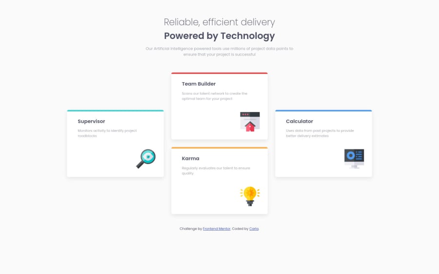
1@iamcgsPosted about 3 years ago@Vueko1 Thanks! I´ve added a border-top to each card with the appropiate color. You can check the css file here https://github.com/iamcgs/four-card-feature-section
1@Vueko1Posted about 3 years ago@iamcgs nvm I know what I did wrong, I simply added too much radius and too low border top value :P but still great project and clean code, gj.
1
Please log in to post a comment
Log in with GitHubJoin our Discord community
Join thousands of Frontend Mentor community members taking the challenges, sharing resources, helping each other, and chatting about all things front-end!
Join our Discord
