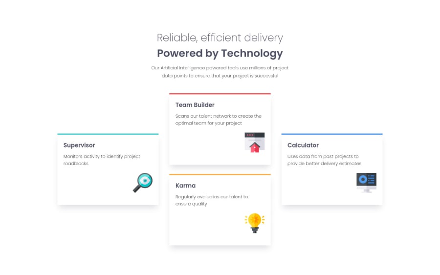
Four card feature section using Html CSS Responsive.
Design comparison
Solution retrospective
Hi developers, any feedback, Suggestion, Advice I would be appreciate it.
Community feedback
- @MarlonPassos-gitPosted about 3 years ago
hello Ahmed, to complement the suggestions that kens has already mentioned
-I would recommend you break cards earlier to avoid this here https://prnt.sc/1v4jnek I would still tell you to focus on building a designer with 2 columns also for the tablet version
-
increase the size of the icons
-
decrease the font thickness
-
It would be nice for you to put more information on your git hub about what you learned from this project
Marked as helpful1@AhmedSaidi99Posted about 3 years ago@MarlonPassos-git Hi Marlon, thank you for taking the time. I did this:
- I broke cards at 767px.
- Lessen font thickness. I wish you take a look.
I will revision the code and information from time to time. I'm just learning right now. Thanks againπ₯°
1 -
- @SizzleCatPosted about 3 years ago
Hi Ahmed, It looks really awesome. Great job. My only suggestions would be to give the headings a heavier font weight to show up as clearly as those in the solution, and also to make the cards a little narrower so the text wraps sooner and there isn't so much white space per card. But other than that, it looks pretty faithful to the original.
Oh whoops, now I realize that I thought your version was the original LOL. I actually think your version looks better than the design because it's more readable, and the composition looks better to me.
Marked as helpful1@AhmedSaidi99Posted about 3 years ago@SizzleCat When I was reading your feedback I was like "π΅". π€£π€£ Thank you for taking the time.
0 - @kens-visualsPosted about 3 years ago
Hi @AhmedSaidi99 ππ»
The only suggestion I have, which will also help to fix the HTML issues, is that replace
<h1>
tags in the cards with<h2>
, because in a page there can be only one<h1>
. Once you fix the issue, don't forget to generate a new report.I hope this was helpful π¨π»βπ» nice work on the layout. Cheers πΎ
Marked as helpful1
Please log in to post a comment
Log in with GitHubJoin our Discord community
Join thousands of Frontend Mentor community members taking the challenges, sharing resources, helping each other, and chatting about all things front-end!
Join our Discord